Pages
on 01-30-2026 12:00 AM by SnapApp by BlueVector AI
5912
Overview
Pages are fully interactive and customizable web screens within SnapApp that serve as the primary way users view and interact with application data. A Page can display a combination of text, media assets (such as images and videos), forms for user input, data views (lists, grids, and custom views), and dashboards for insights and reporting.
Pages are built using PageBuilder, SnapApp’s intuitive drag-and-drop editor, which allows users to design layouts visually without writing code. This makes it easy to create responsive, data-driven interfaces, while still giving advanced users the flexibility to enhance pages with custom HTML, CSS, and JavaScript when needed.
What are Pages in SnapApp?
Pages in SnapApp are fully customizable web screens that allow you to present information and build user interfaces inside your application.
A Page can contain:
- Plain text and formatted content
- Images, videos, and other media assets
- Forms for user input
- Views such as lists, grids, and dashboards
- Data-driven components connected to objects or databases
Pages are created using PageBuilder, SnapApp’s visual, drag-and-drop editor. This means you do not need coding knowledge to build professional-looking pages, although advanced users can still add custom HTML, CSS, and JavaScript if required.
Pages are commonly used to:
- Create application dashboards
- Display object records in a user-friendly way
- Design landing pages or internal screens
- Build responsive UI layouts for desktop and mobile users
Learn Page Builder Step-by-Step
If you are new to PageBuilder, we strongly recommend starting with the official training course:
Page Builder Training Course Start the course here
This course walks you through PageBuilder concepts with hands-on examples.
Table of Contents
- How to create a Page?
- Import Custom HTML and CSS
- Attach Custom JavaScript and CSS
- How to edit Page properties?
- Page Properties Explained in Detail
- Page Clone
- Detail view of the Page
- How to delete a Page?
- Display Mode
- How to publish a Page?
- View Components
- How to preview a Page?
- View Code
- Delete Page Components
- How to add components in a Page?
- How to customize each component of the Page?
- Styling Categories Explained
- How to set conditions for a component?
- How to layer different components of a Page?
- Using Dynamic Values
- Example of Using Dynamic Values
- Example of Expressions and Formulas
- 1. Using Lookup in Dynamic Content
- 2. Conditional Visibility
- 3. User-based Condition
- Example of SQL List component configuration
- Example of SQL Grid component configuration
- Example of Controller View component configuration
- Example of Controlled View component configuration
- Key Notes for Configuration
- Glossary
- Troubleshooting
How to create a Page?
Creating a page is the first step to designing a user interface in SnapApp.
Follow the steps below carefully:
-
From the top navigation bar, open the User menu and select Settings. This is where all configuration-related options are available.
-
In the left navigation bar, go to UX → Pages. This section displays a list of all pages created in your application.
-
Click on
+ Add Newto create a new page.

-
Enter a Page Name. This name helps you identify the page while working in PageBuilder. It can later be hidden if you do not want it displayed to users.
-
Enter a Slug value. The slug defines the page’s URL. It should:
- Use lowercase letters
- Contain no spaces
-
Use hyphens (
-) instead of spaces Example:customer-details -
Enable the Active checkbox. Only active pages can be accessed or published.
-
Click Save.
After saving, SnapApp automatically opens the PageBuilder, where you can visually design and edit the page.

Import Custom HTML and CSS
If you already have a pre-designed web layout, you can reuse it instead of building from scratch.
The Import feature allows you to paste:
- Existing HTML structure
- Custom CSS styles
Steps to import:
- Open the page in PageBuilder.
- Click the Import icon located at the top-right corner.
- Paste your HTML and CSS code into the Import Template area.
- Click Import to apply the layout.
This is useful when:
- Migrating an existing website
- Using a custom UI design
- Reusing templates across multiple pages

Attach Custom JavaScript and CSS
In addition to inline HTML and CSS, SnapApp allows you to attach external JavaScript and CSS files.
This is useful for:
- Adding advanced interactivity
- Applying global styles
- Using custom scripts across pages
To attach files:
-
Click the Paperclip icon in the PageBuilder header OR open the Pages list view and click the Pencil icon to edit the page.
-
Scroll to the Attachments section.
-
Click
+ Add Newto upload a file. -
Set the Type to File.
-
Upload your JavaScript or CSS file.
-
Enable the Active toggle and click Save.
You may attach multiple files, and they will load automatically when the page is rendered.


How to edit Page properties?
Page properties control how the page behaves, who can see it, and how it is linked to data.
To edit properties:
- In PageBuilder, click the Edit Properties icon in the top-left corner.
- Update the required fields.
- Click Update to save changes.
SnapApp also keeps a version history, allowing you to revert to an earlier version if something breaks.

Page Properties Explained in Detail
| Property | What it means |
|---|---|
| Name | Internal display name of the page inside PageBuilder |
| Page Object | Links the page to a specific object; without this, the page behaves as a main page |
| Slug | URL identifier used to access the page |
| Page Version | Allows restoring older saved versions of the page |
| Application ID | Determines which application the page belongs to |
| Hide Sidebar | Removes the left navigation bar to maximize workspace |
| Visibility | Public pages are accessible to everyone; Private pages require login and permissions |

Page Clone
Cloning allows you to create a duplicate of an existing page.
This is helpful when:
- Creating similar layouts
- Reusing designs
- Avoiding repetitive work
Click the Clone icon in PageBuilder to instantly create a copy.


Detail view of the Page
The Detail View displays complete information about a page, including metadata and configuration details.
Click the Pin icon in PageBuilder to open the detail view.


How to delete a Page?
To permanently remove a page:
- Open the Pages list view.
- Click the Delete icon next to the page.
Deleted pages cannot be recovered.

Display Mode
Display Mode allows you to preview how your page looks on different screen sizes.
Available modes:
- Desktop Mode – Default layout for large screens
- Tab Mode – Optimized for tablet devices
- Mobile Mode – Optimized for smartphones
This helps ensure your page is responsive and user-friendly across devices.

How to publish a Page?
Publishing a page makes it live and accessible to users. Until a page is published, it remains in draft mode and cannot be accessed using its URL.
To publish a page:
- Open your page in the Page Builder.
- Click on the Publish button located in the top middle header of the Page Builder.
Once published:
- The page becomes live immediately
- The page URL becomes active
- Any latest changes are visible to users
Access to the page depends on its Visibility setting:
- Public → Anyone with the page link can view it, even without logging in
- Private → Only logged-in users with the required permissions can access the page

If you make further changes after publishing, you must publish again for those updates to reflect.
View Components
The View Components option helps you quickly select all components present on the page canvas.
To use it:
- From the Page Builder, click the View Components icon in the top-right header.
This action:
- Selects every component on the canvas at once
- Makes it easier to move, inspect, or manage multiple components together
- Is useful when working with complex layouts containing many elements

How to preview a Page?
Previewing allows you to see how the page will look to end users without publishing it.
To preview a page:
- Open the page in Page Builder
- Click the Preview icon in the top-right header
The preview:
- Shows the page exactly as it will appear when published
- Helps you verify layout, content, and responsiveness
- Does not affect the live version of the page

Always preview your page before publishing to avoid layout or content issues.
View Code
The View Code feature lets you inspect the underlying structure of the page.
To view the code:
- From the Page Builder, click the View Code icon in the top-right header
This opens:
- The generated HTML
- The associated CSS
Important notes:
- The code is read-only
- It cannot be edited directly
- This is useful for developers who want to understand how Page Builder renders components

Delete Page Components
If you want to clear the entire page layout at once, you can delete all components from the canvas.
To delete all components:
- From the Page Builder, click the Delete Canvas icon in the top-right header
This action:
- Removes all components from the page
- Does not delete the page itself
- Cannot be undone

Use this option carefully, as all components will be removed permanently.
How to add components in a Page?
Components are the building blocks used to design a page layout.
To add components:
- Open the page in Page Builder
- Click the ➕ (Plus) icon in the top-right header
- Select a component from the Components panel
- Drag and drop it onto the canvas
Below is a detailed explanation of each available component:
| Component | Description |
|---|---|
| 1 Column | Adds a single column container used to place components vertically |
| 2 Columns | Creates a row divided into two equal-width columns |
| 3 Columns | Creates a row divided into three equal-width columns |
| 2 Columns 3/7 | Creates two unequal columns with a 3/7 and 4/7 width split |
| Text | Adds an editable text block to display content |
| Link | Adds clickable text that navigates to a configured URL |
| Image | Allows you to upload or link an image and display it on the page |
| Video | Embeds a video with configurable source, provider, and poster |
| Map | Displays a map with configurable location and map type |
| Link Block | Adds a clickable block-style link |
| Quote | Displays a quotation-style text block |
| Text Section | Adds a section with two separate text boxes |
| Custom Code | Allows insertion of custom HTML, CSS, or scripts |
| Grid | Creates a container with parallel columns inside a row |
| Col | Adds a column (default width is 12); breakpoints can be configured |
| Row | Adds a horizontal row used to structure layouts |
| Button | Adds a clickable button with configurable theme, size, and action |
| Card | Displays a card layout with header, description, footer, and image |
| Alert | Displays alert or notification-style messages |
| List | Adds a list with multiple list items |
| List Item | Adds an individual item to an existing list |
| Table | Adds a table with rows and columns |
| Typography | Advanced text with customizable heading styles and themes |
| Badge | Displays highlighted labels or tags |
| Dynamic View | Displays an object without a predefined custom view |
| Custom View | Displays a view you have already created |
| SQL List Repeater | Displays records from an object in list format |
| SQL Grid Repeater | Displays records from an object in grid format |
| Field | Displays a specific object field dynamically using [[field_name]] |
| Dashboard | Embeds an existing dashboard into the page |
| Workflow Action Button | Triggers a workflow or redirects to its URL |
| Controller View | Acts as a master view to control child views |
| Controlled View | Acts as a child view controlled by a controller view |
Components can be customized further using the Settings panel once added to the page.
How to customize each component of the Page?
Each component added to a page can be visually customized to match your design and branding requirements. SnapApp provides a Style Manager that allows you to control the appearance of individual components without writing code.
To customize a component:
- Open your page in the Page Builder.
- Click on the Open Style Manager icon located in the top-right header of the Page Builder.
- Click on the specific component on the canvas that you want to style.
Once selected, the Style Manager displays multiple styling categories that control different visual aspects of the component.
Styling Categories Explained
-
General Controls common properties such as display type, visibility, and basic alignment.
-
Dimensions Used to adjust width, height, padding, margin, and spacing. This helps control how much space a component occupies on the page.
-
Typography Allows you to change font family, font size, font weight, text color, alignment, and line spacing.
-
Decorations Used for visual enhancements such as background color, borders, border radius, shadows, and opacity.
-
Extra Contains advanced styling options such as custom classes and additional styling behavior.
Using these options, you can easily change the font style, resize components, or apply background colors to match your page layout.

How to set conditions for a component?
Conditions allow components to appear or behave differently based on specific rules. This makes pages dynamic and context-aware.
For example, you may want to:
- Show a component only when a condition is true
- Hide certain elements based on user roles or data values
- Display different content depending on record data
To set conditions for a component:
- Open the page in the Page Builder.
- Click the Settings icon in the top-right header.
- Click on the component for which you want to define conditions.
Within the component settings, you can configure conditional rules such as Show If or Hide If based on expressions or field values.

Conditions are especially useful for role-based views, approval flows, and personalized user experiences.
How to layer different components of a Page?
Layering controls the stacking order of components on a page. This determines which components appear on top when elements overlap.
To manage layers:
- Open the page in the Page Builder.
- Click the Open Layer Manager icon in the top-right header.
The Layer Manager allows you to:
- Reorder components vertically
- Move components above or below others
- Arrange nested elements within a single component
For example, inside a Card component, you can rearrange the header, image, body, and footer sections to change their display order.

Layering is useful when building complex layouts or overlapping UI elements.
Using Dynamic Values
Dynamic values allow you to display real-time data from objects directly inside page components. These values are referenced using double square brackets: [[field_name]].
This feature is commonly used for:
- Displaying record-specific information
- Creating dynamic templates
- Building reusable pages that adapt based on data
Example of Using Dynamic Values
To display a registration number dynamically from an object field:
<div class="field-box">[[registration_number]]</div>

Example of Expressions and Formulas
The Page Builder supports expressions and formulas for enhanced customization, enabling dynamic content rendering and conditional logic. These use triple brackets [[[...]]] for evaluation, making it easy to calculate values, fetch data, or control the visibility of elements.
1. Using Lookup in Dynamic Content
Fetch a contact’s email using their contact_id:
=[[[LOOKUP('[[contact_id]]', 'contacts', 'id', 'email')]]]
2. Conditional Visibility
Hide a section when the [[field_name]] value is not 1:
<div showif="[[[IF(field_name == 1)]]]">...</div>
Note: Use the showif attribute within your component’s HTML tag. The expression inside triple brackets will be evaluated.
3. User-based Condition
Display a message to all users except those in a specific list:
<div
  showif="[[[NOT(IN(USERID(), SELECT('tokens', 'user_id', None, None, True)))]]]"
>
  ...
</div>
Example of SQL List component configuration

Example of SQL Grid component configuration
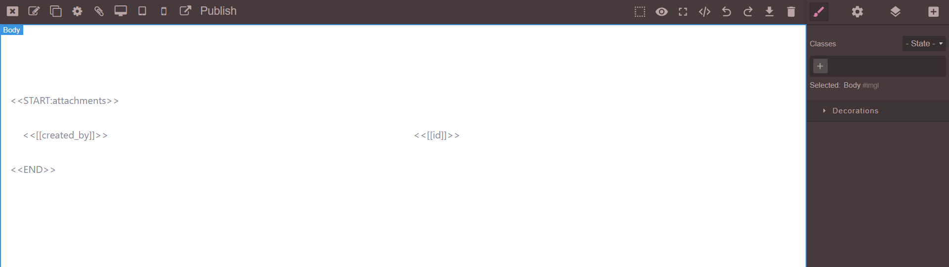
The above example will show the records for ID and Created_by fields of the Attachments object. Once the Page is published, you can add the ID of the record in the Page URL.
Example of Controller View component configuration
The Controller (Master) View defines the parent view that controls one or more child views. In the example below, the Producer View is configured as the Controller with the following settings:
- View Type:
List - Name:
pro-list

Example of Controlled View component configuration
The Controlled (Child) View is linked to a Controller View and displays data related to it. In the example below, the Anime view is configured as the Controlled View with the following settings:
- View Type:
List - Master View Name:
pro-list(name of the Controller View) - Ref Field: A shared field between the Controller and Controlled Views that serves as the Foreign Key.

Key Notes for Configuration
- Master View Name: Set the name of the Controller (e.g.,
pro-list) in the configuration for the Controlled View. - Ref Field: The Ref Field must be common to both views and act as a Foreign Key, ensuring the relationship between the data.
Glossary
- Slug: The URL-friendly identifier for a page.
- Ref Field: A field used to link related data between views (acts as a foreign key).
- Master View: The parent view in a controller-controlled view relationship.
- Controlled View: The child view that is filtered or controlled by a master view.
Troubleshooting
- Custom CSS/JS not applying: Ensure files are uploaded, active, and attached to the correct page.
- Page not saving: Check for required fields and internet connectivity.
- Dynamic values not rendering: Confirm field names are correct and enclosed in double brackets.
- Publishing issues: Make sure you have the necessary permissions and the page is set to active.
Thank you for following these steps to configure your SnapApp components effectively. If you have any questions or need further assistance, please don’t hesitate to reach out to our support team. We’re here to help you make the most out of your SnapApp experience.
For support, email us at snapapp@bluevector.ai