SnapApp Field Types - Icon
on 01-16-2026 12:00 AM by SnapApp by BlueVector AI
335
Icon Field
The Icon field type allows users to select, store, and display visual glyphs from the integrated SnapApp icon library. Icons are often used to provide quick visual cues for status, categorization, or navigation within the application interface.
Icon Field Properties
Note: Every field in SnapApp shares a set of universal properties, such as Display and Edit settings, that are configured during creation.
To find more information on these foundational settings, please click the link below: SnapApp Fields Fundamentals
Basic Properties
The Basic Properties tab establishes the field’s identity and its relationship to the parent object.
| Property | Description |
|---|---|
| Data Type | Set to Icon. This enables the system icon picker. |
| Object | The parent object this field belongs to. |
| Label | The user-facing name, such as “Status Icon” or “Asset Category Glyph”. |
| Column Name | Prepopulated from the Label (e.g., visual_icon). |
| Description | Internal notes explaining the intended use or meaning of icons in this field. |
Data Type Properties
When the Icon data type is selected, specialized configuration options appear to control the visual styling and behavior:
- Icon Style: A dropdown menu to modify the size, animation, and rotation of the icon.
- Sizes:
size_2xs,size_xs,size_sm,size_lg,size_xl,size_2xl. - Animations:
animate_beat,animate_fade,animate_bounce,animate_flip,animate_shake,animate_spin. - Rotations:
icon_rotate-90,icon_rotate-180,icon_rotate-270. - Icon Color Theme: Sets the color palette for the glyph based on your app theme.
- Options:
none,primary,secondary,success,info,warning,danger,light,dark.

User Interface & Selection
SnapApp provides a robust Pick an Icon modal to help users navigate a library of over 29,000 glyphs.
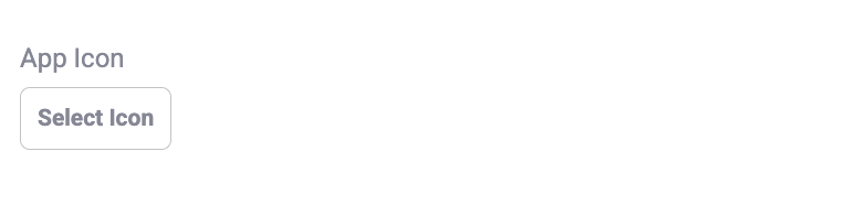
- Trigger: Clicking the Select Icon button on a form opens the selection interface.
- Search & Filter: Users can search for specific icons by name or filter the library by weight and style:
- Categories: Solid, Regular, Light, Thin, Duotone, and Brands.

Thank you for following these steps to configure your SnapApp components. Building a well-structured data environment is the first step toward creating a powerful, automated application that scales with your needs.
For further assistance , email us at snapapp@bluevector.ai