Application Settings
on 01-27-2026 12:00 AM by SnapApp by BlueVector AI
2814

This section provides general instructions for configuring your Application Settings .
Table of Contents
- Navigate to Application Settings
- 1. Application Info
- 2. Style & Typography
- Theme Selection
- Theme Colors
- *
- 3. Navigation Colors
- 4. Application Features
- *
- 5. Email Settings
- 6. Application Branding
- 7. Saving and Applying Changes
- 7. Navigation & Organization
- Menus
- Breadcrumbs
Navigate to Application Settings
To access your application settings configuration:
-
Log in to your SnapApp instance.
-
Open the User Menu (top-right corner) and select Settings.
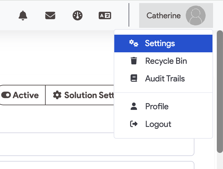
- In the left sidebar, navigate to the Home section and select Application Settings.
Note: Create button in the header to instantly add Objects, Fields, or Workflows without navigating away from your current settings page.
1. Application Info
- Name: The internal and display name of your application.
- Description: A short summary of the application’s purpose.
- Default Start Page: The URL or relative path of the first screen a user sees after logging in.
- Default App Folder: The server-side directory path for application-specific data (typically left as default).
- Active Toggle: Use this switch to enable or disable user access to the application.
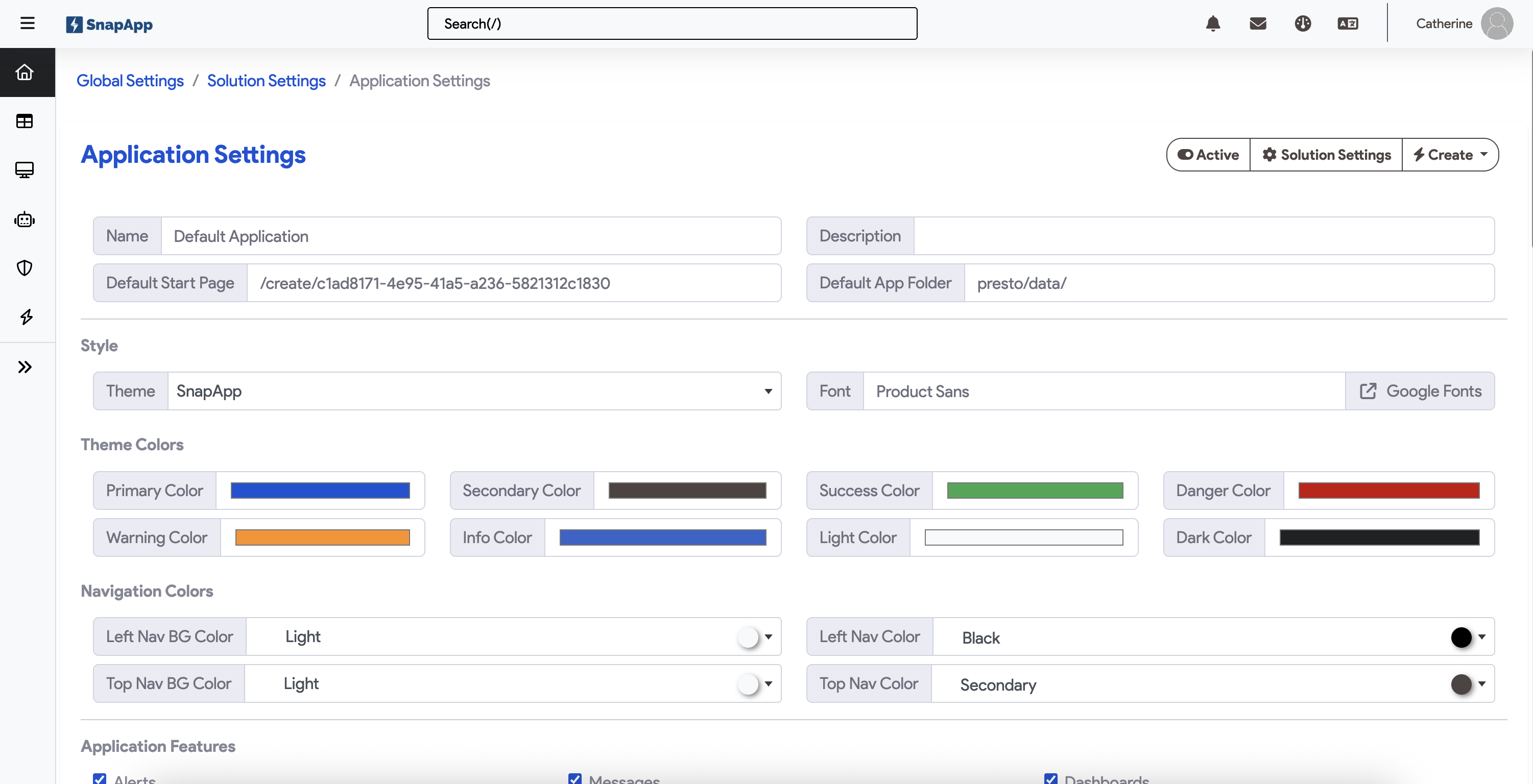
2. Style & Typography
Customize your apps branding and UI to match your brand.
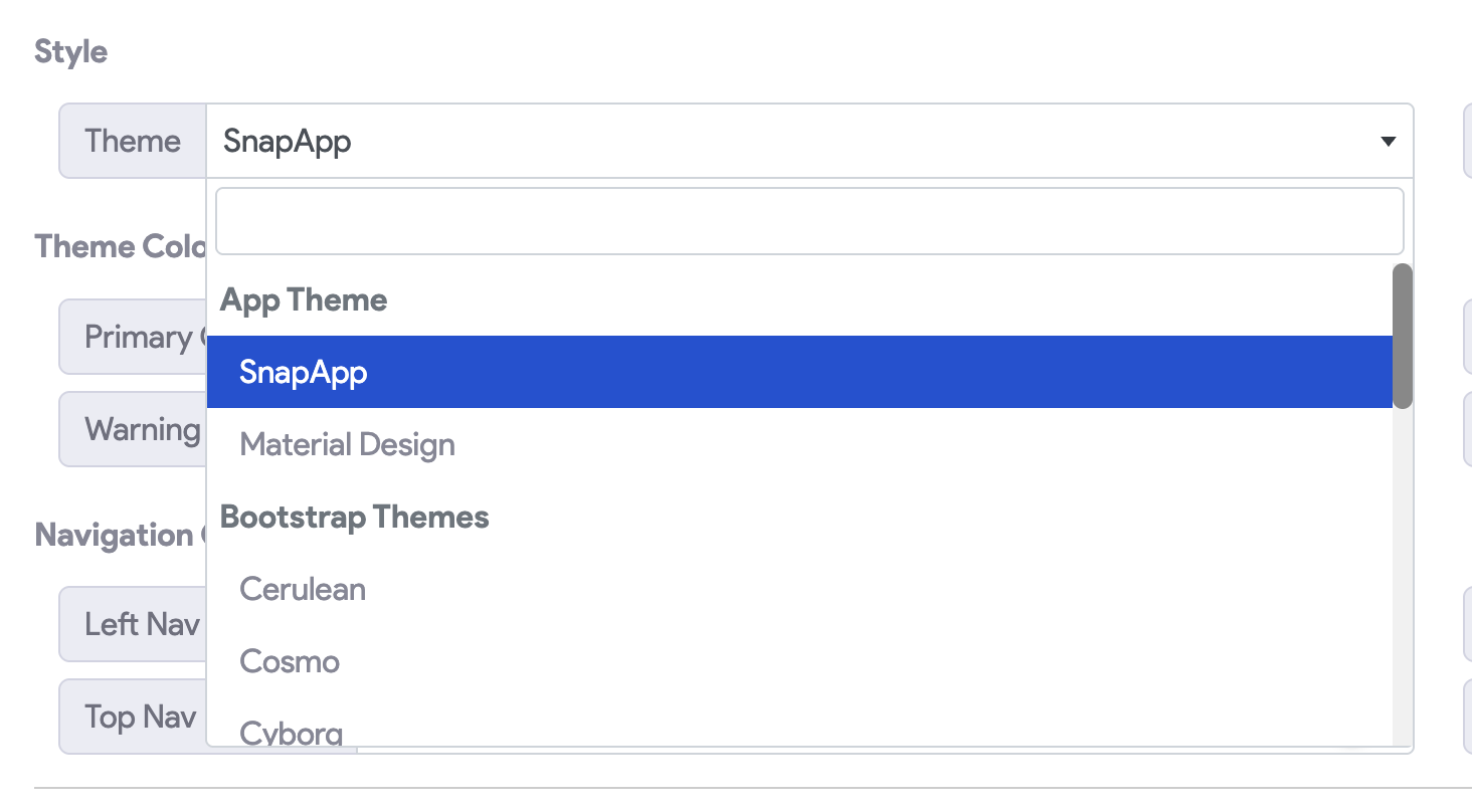
Theme Selection
- Theme Dropdown: Choose from preset themes or select Custom Theme to unlock manual color overrides.
- Font: Integrated with Google Fonts. Selecting a font here updates typography across all headers, buttons, and body text globally.
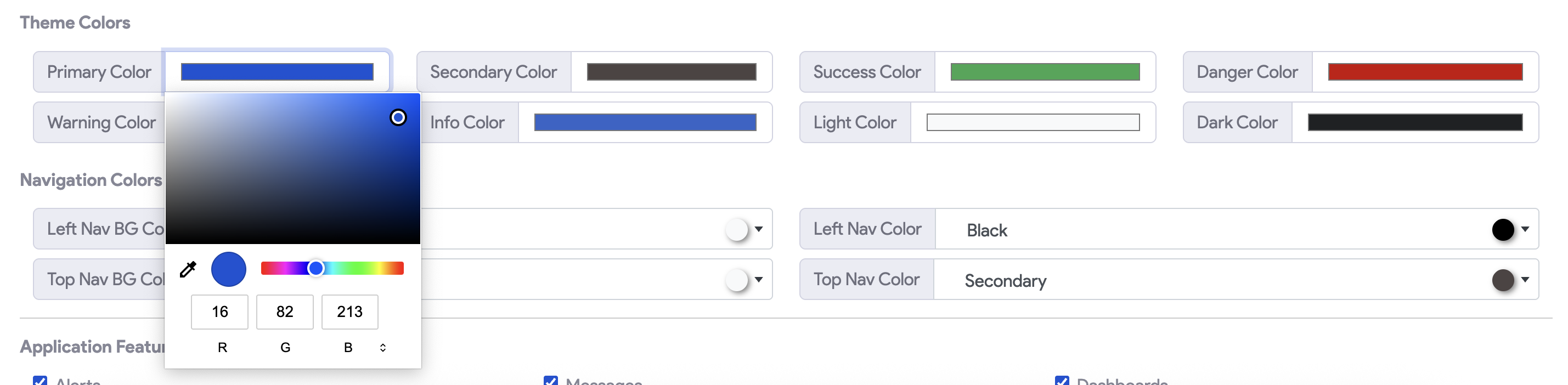
Theme Colors
These colors define the “semantic” meaning of UI elements. You can adjust the color by clicking the color bar on the element to pull up the color picker. You can adjust in the color spectrum or enter a Hex value.
| Color Type | Default Hex | UI Usage |
|---|---|---|
| Primary | #0166e1 |
Main action buttons, active navigation states. |
| Secondary | #6c757d |
Cancel buttons, secondary information. |
| Success | #b3e535 |
Completion messages, “Save” indicators. |
| Danger | #c90303 |
Error states, delete actions, alerts. |
| Warning | #fe8f18 |
Cautionary notices, pending states. |
| Info | #23c1c4 |
Tooltips, help text, general notifications. |
3. Navigation Colors
Customizing the navigation bars ensures the app feels like a cohesive part of your brand.
- Left/Top Nav Color: Sets the background hex code for the primary navigation bars.
- Icon Color: Sets the color for icons within the navigation bars. Note: Ensure high contrast against the background color for better accessibility.*

4. Application Features
These checkboxes control the modular components of your application. Enabling them adds specific UI elements and background logic to the app.
| Feature | Functionality |
|---|---|
| Alerts | Enables a notification system within the app to display real-time system alerts or user-triggered notifications. |
| Messages | Activates the internal messaging module, allowing users to communicate with one another directly within the platform. |
| Dashboards | Allows users to access graphical data visualizations. |
| Translations | Enables a language dropdown for real-time interface translation. When checked, a language selector typically appears in the user profile or header. |
| Embedded External Agent / GenAI | Toggles “Embedded External Agent” or Generative AI capabilities, such as automated summaries or AI-assisted chat (if configured). |
| Search | Adds a global search bar to the top navigation, allowing users to query records across authorized objects and fields. |
| Custom Footer | Activates a dedicated area at the bottom of the application for links, copyright info, or custom branding. |
| Header Icon | Controls the visibility of your application’s logo or icon within the top navigation bar. |
UI / UX Features
- Compact Lists: Reduces padding and row height in data tables. Recommended for data-heavy applications where power users need to see maximum information with minimal scrolling.
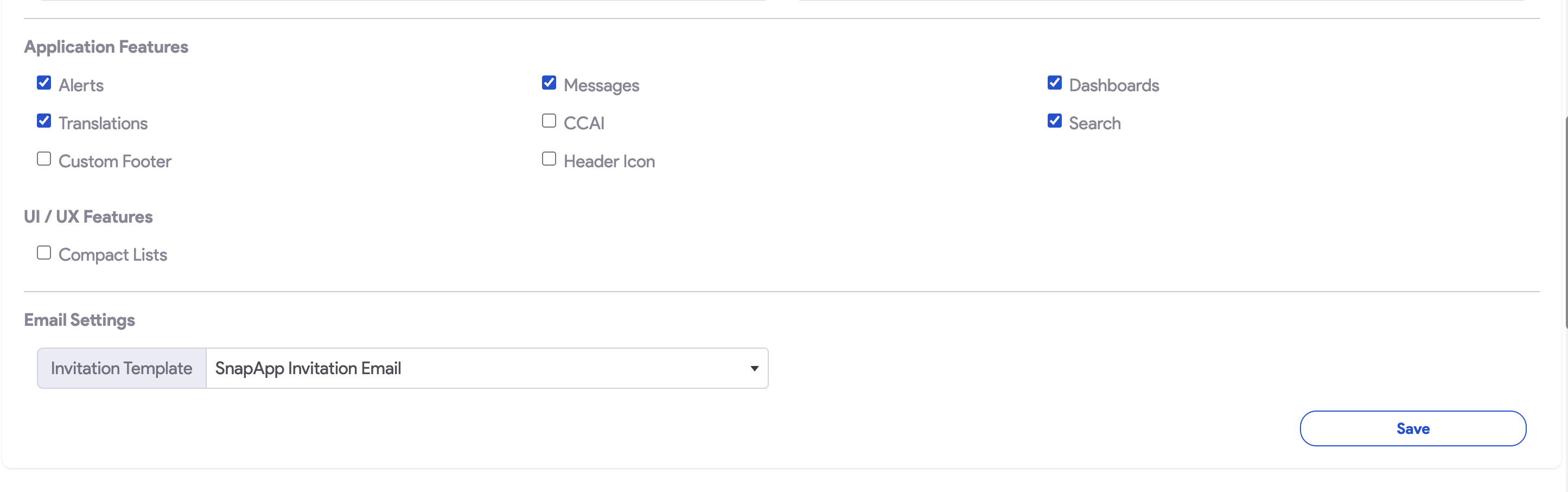
5. Email Settings
Configure how the application communicates with users during the onboarding process.
- Invitation Template: Select the specific email layout sent when new users are invited to join the application. You can use the standard “SnapApp Invitation Email” or a custom-branded template.
6. Application Branding
These assets override global settings to ensure the application environment matches a specific brand identity.
- App Logo: The primary brand image displayed in the navigation header.
- App Favicon: The small icon displayed in the browser tab (Recommended:
.icoformat). - Custom Theme: Allows the upload of a theme file to apply a specific color palette and UX elements in the across the UI as defined in the uploaded CSS. Once the .css file is uploaded, scroll up to the Theme dropdown and select Custom Theme.
- Custom CSS: Upload a stylesheet to override specific UI elements like button radiuses or font weights.
- Custom JS: Upload a JavaScript file to inject custom logic or third-party analytics.
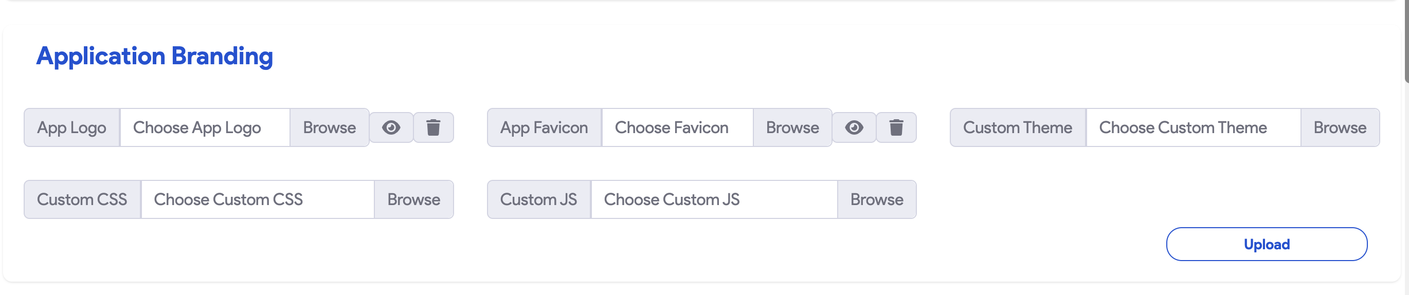
Clicking the Upload button in the Application Info section will save and upload the data you have provided
7. Saving and Applying Changes
The application settings use a two-part save process to manage both data and file uploads.
- Save Button: Click this to commit changes made to Features, UI/UX, and Email Settings.
- Upload Button: Click this specifically to process and store branding assets (Logos, Favicons, CSS, and JS). Ensure you click this after selecting files to ensure they are properly stored on the server.
7. Navigation & Organization
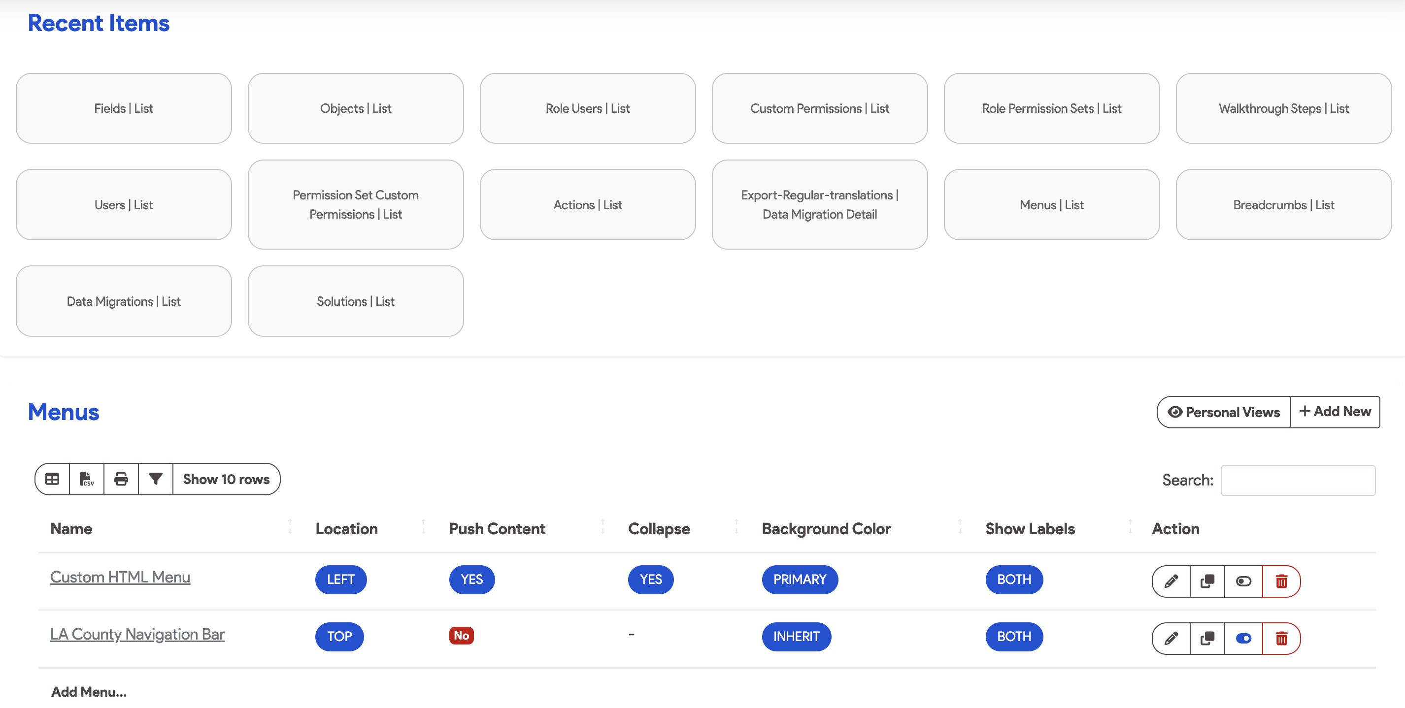
Recent Items
The most recently visited items in the current application can be viewed in the Recent Items List
Menus
The Menus section displays all navigation structures currently associated with the application.
- Configuration: Menus represent your primary navigation bar and determine the links visible to your users.
- Management: You can define which menus are active here, though specific menu item links and hierarchies are configured within the Menus Settings.
Breadcrumbs
Breadcrumbs provide a secondary navigation aid that reveals the user’s location in the application hierarchy.
- Visual Path: They display a “trail” of parent records or pages (e.g.,
Home > Projects > Task Details). - Efficiency: This allows users to navigate back to parent items or higher-level views with a single click.
Click on + Add New to open the configuration settings for Breadcrumbs
- Detailed Setup: For advanced breadcrumb configuration, refer to the Breadcrumbs Documentation.
Support & Next Steps
To manage who can edit these settings or configure within your app. visit the Roles & Permissions Guide
Support: For assistance, contact our team at snapapp@bluevector.ai.